Major redesign of Homepage and Add Feed page
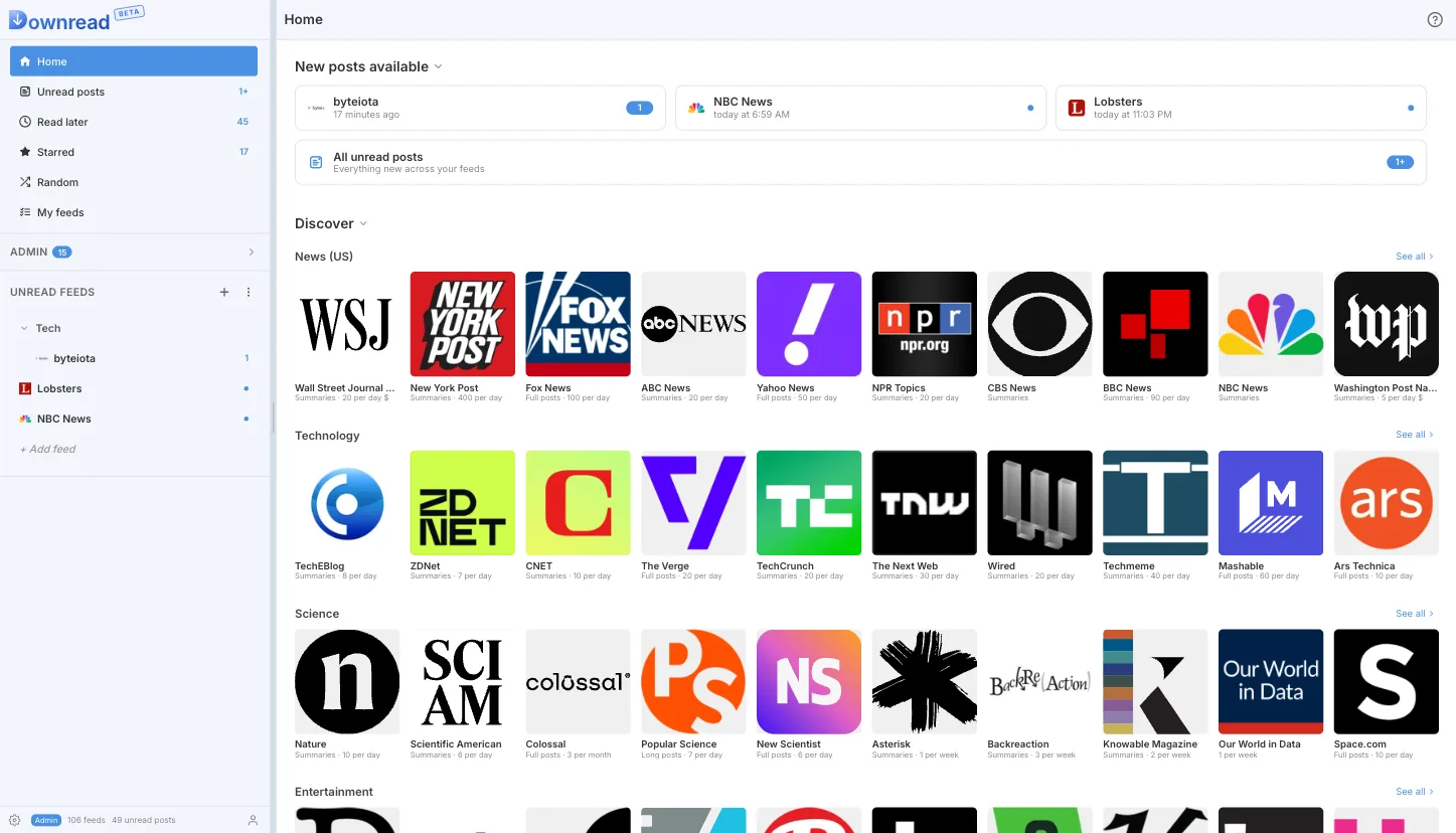
If you log in today, you will notice that Downread's Homepage has been completely overhauled. On a desktop, it looks like this:
And this is the mobile layout:
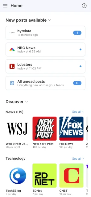
The new layout probably reminds you of podcast apps, and this is no coincidence. I am trying to move away from long texts on the homepage that hardly anyone reads, and replace them with an intuitive design that can get you reading instantly: click on one of the tiles, and you're immediately in the reader. No need to follow the feed anymore, no preview button, just jump right in.
This is what it looks like for a new user:
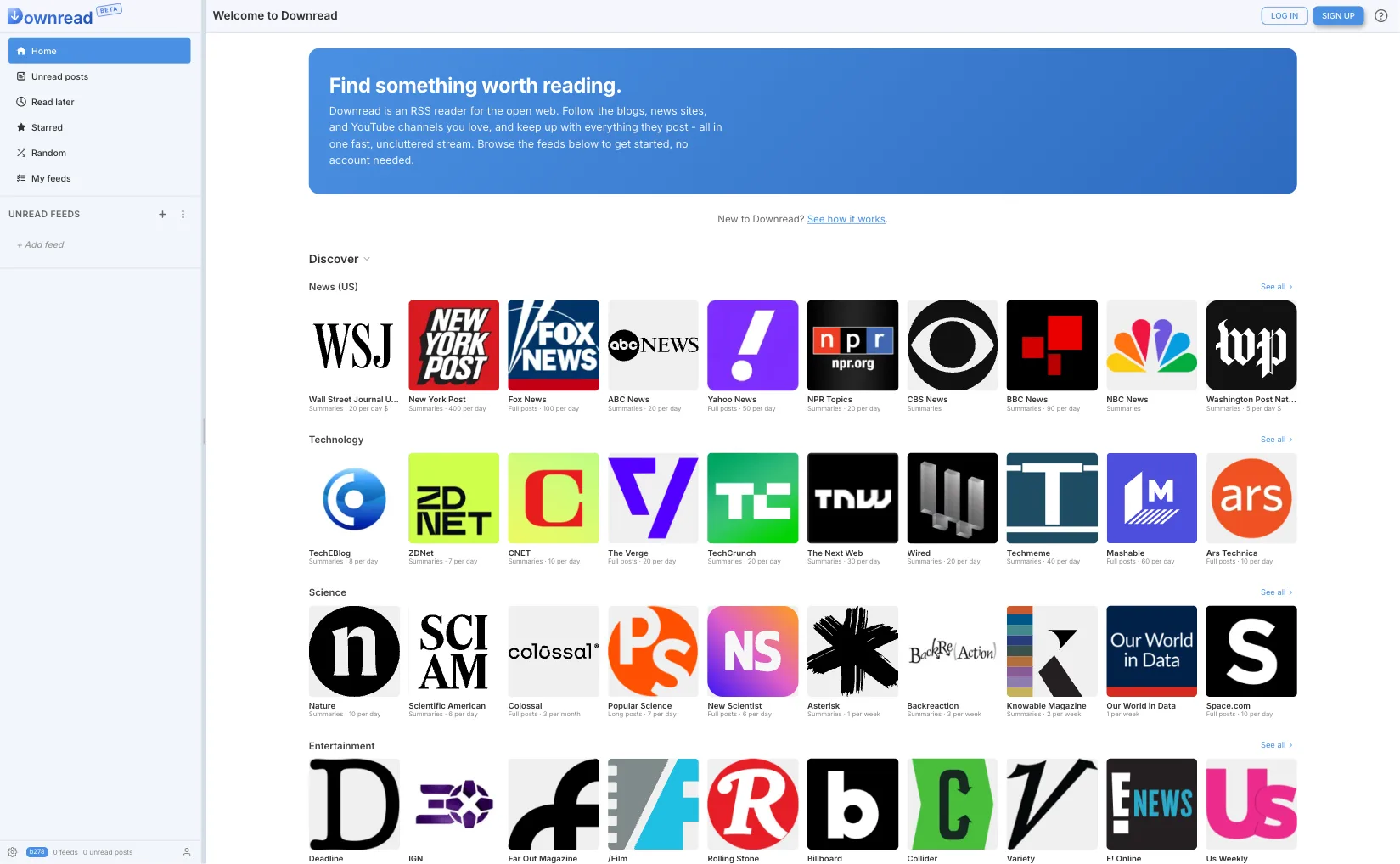
Again, not a lot of text, no onboarding process. Just a UI that feels natural to anyone who has ever used a podcast player or an ebook.
Add Feed
The Add Feed page also got a redesign. While it also uses tiles for the most popular feeds, its main features remain search and the feed catalog. The feed catalog has a new icon design, and like the homepage, viewing a feed means diving right in. No more preview popups with limited text.
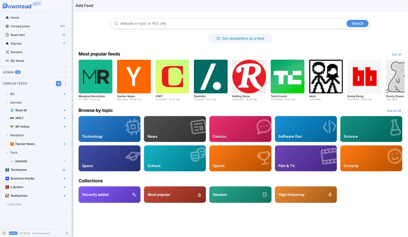
The only thing that has not been touched yet is the search. This is planned for the next major UI update.